THE PROCESS:
On the block of The High School of Fashion Industries there are six main window displays (not including the interior windows) that needed to be filled with something for the Spring 2017. The idea of six different major artist circulated the classroom. There were groups assigned randomly and an artist assigned to each. As for my group, we had Jackson Pollock. With Expressionism being his main focus we knew this had to be displayed somehow. Each individual in our group created their own sketch and model of an idea they believe can work as a full display. Ultimately, we had to squish these ideas into one.
Group Member #1 Idea:

Group Members #2 Idea:

Third Group Member idea not shown (but it was a similar concept to the others).
Here’s our FINAL MODEL!

TESTING.. TESTING..!
A search for materials began to see what is currently available to us that can be used for our benefit. There was an ongoing test with different textured papers to see which would respond best with paint splatted on top and the finished look for our background. Not only did we have to test a variety of papers but a large section of paint needed to be analyzed as well! There are different paints within different finishes to them and the weight of each can determine how if it’ll drip or not.
Materials:
-Foam core
-Wrapping paper (Black & brown)
-Tempera/Acrylic Paint
-Mannequin
-Fishing wire
-Props
Wrapping our backgrounds with large construction black paper we tried multiple techniques of how to splat the paint. Seemed easier than we thought! After a few failed attempts, not capturing the Jackson Pollock look, at all, we decided to study some YouTube videos/ photos. After watching Jackson Pollock painted for some time we finally picked up a flicking technique that’ll work for us.
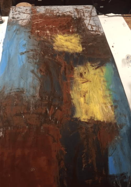
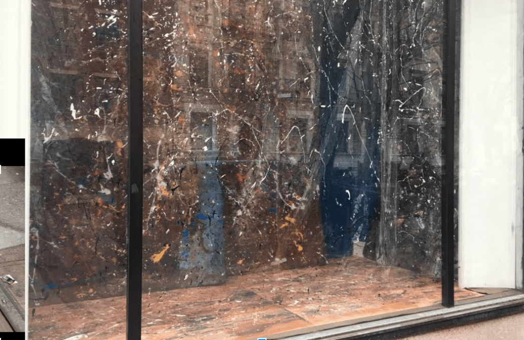
The color palette held a strong importance for this project as it was for his art. All backgrounds, floor, panels needed to remain consistent therefore we painted the main BASE colors all over brown, black, yellow, and blue. Afterwards we splatted the paint in portions. Once the floors, walls, and sidewalls were complete we hung up the transparent panels that will appear to be like dividers in the window. Oh.. must a mention another unexpected challenge? The paint began to peel off the plastic panels therefore another paint test needed to be done. Speaking of challenges.. we struggled with this little corner in our window that was measured wrong from the floors. (Picture attached).
BASE COLORS:
THE TEAM:

SPLAT SPLAT SPLAT (Don’t worry those little lifted corners were fixed):

Before our mannequin was installed:
Corner Struggle:

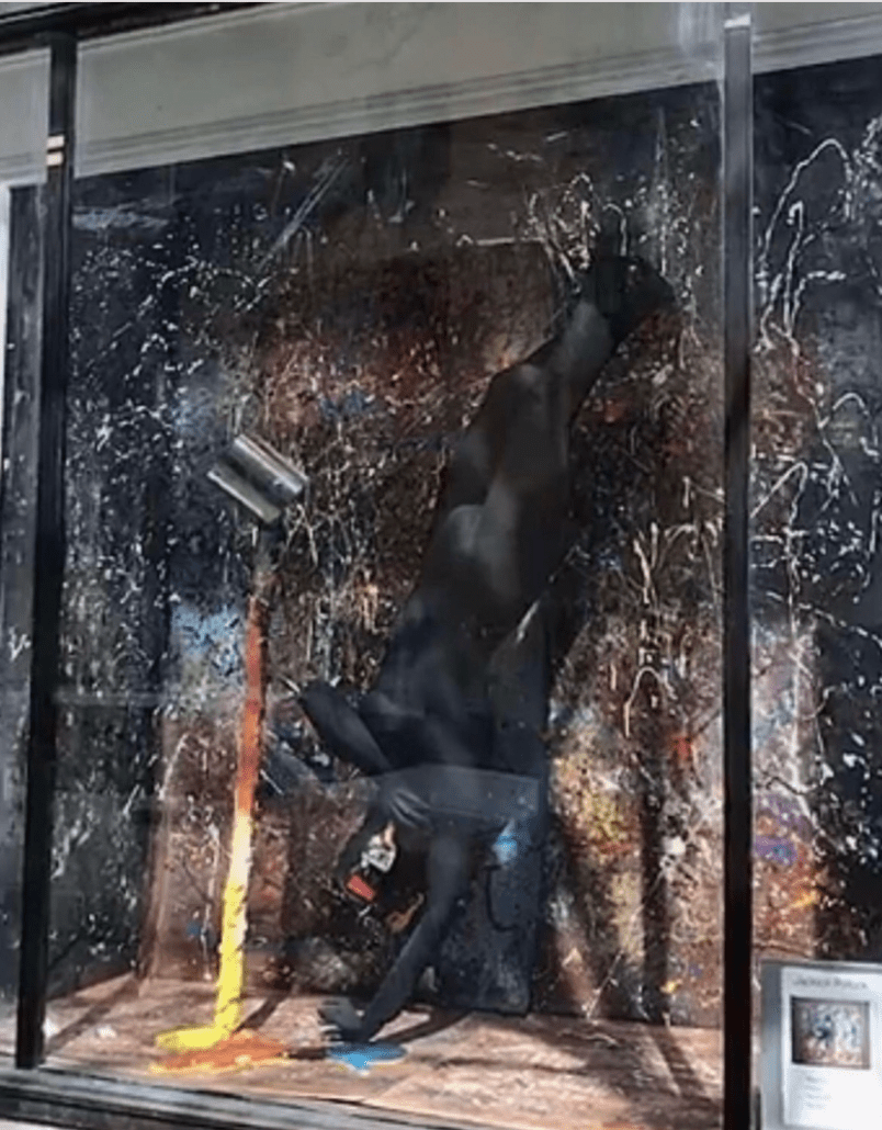
Our mannequin was painted all black to create a pop out effect with the colorful splatters in the surrounding. He was a struggle to tie upside down though! The wires we were using were snapping from the weight therefore a wire test was conducted. Ultimately it worked out and we screamed! We wanted to show this mannequin was inside a painting. For some props, we used the spilling paint bucket we found around the basement of the school (fit perfectly for our theme!) and a paintbrush. The colors seemed like they were flowing out from the paint can.
HERE’S OUR FINAL DISPLAY! (Excuse the glare):